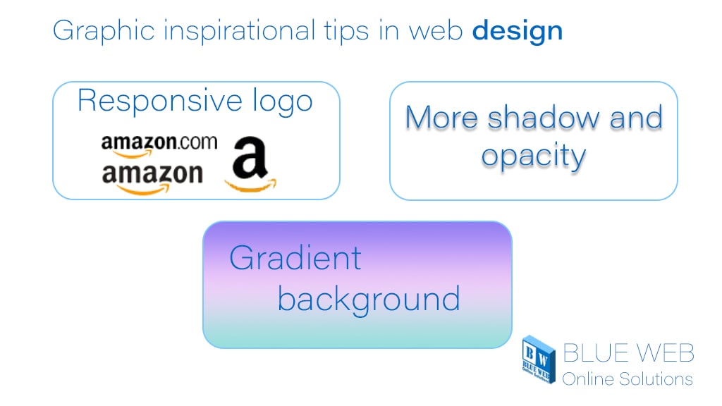
Seven Graphic inspirational tips in web design
If you want to add modern and contemporary styles to your graphic design, apply the following methods in your site design. In the following, we will introduce these methods in website design.
What are inspirational tips in web design?
1-Responsive logo
One of the inspirational tips in web design is the Responsive Logo. Logo design in today’s tech world needs to be done more professionally than ever before. Today, logo designers have to adapt to different smart devices so that their logo design can be displayed flexibly on screens with different sizes and resolutions.
In designing a responsive site, the logo design must also be responsive. Unlike the classic sophisticated and detailed logo design, today, the best logo design is simple and flexible. It optimizes the logo design for various devices such as phones, tablets, and even a giant advertising billboard.
2-Gradient background
The other inspirational tip in web design is the role of gradients in site design. The gradients in site design in 2020 have become more prominent. We have seen these backgrounds in abundance in Instagram filters. The main feature of these backgrounds is having two or three colors and being fresh and modern.
3-More shadow and opacity (with semi-flat design)
Shadows like gradients in 2020 are used in the site’s graphic design, including icons and images, websites, application interfaces, and even print designs. It seems that in 2020 we will see the revival of shadows, which means the improvement of Flat design.
A shadow printing process in which a shadow is printed on contrasting colors to create a two-color image is a technique that has found a new approach to digital media.
4-Pallets and patterns inspired by the 80s and 90s
In this style, layers with different colors, textures, and depths are combined to provide a beautiful and eye-catching combination for your main design background. Using a suitable color palette in graphic design plays an essential role.

5-Animations and gifs
Animation can provide ideas and points of view for more fundamental understanding. In a world where people have limited time, animation can convey complex ideas in a short amount of time with more appeal. In 2020, we will see more effects of animation and gif images on websites. The interactivity of the animations encourages the user to stay on the site. The use of moving logos and logos in the design of the site allows companies to be seen more.
6-Bold and prominent typography
Typography, as a graphic element in website design and the collection of minimalist styles of 2020, is included. More and more businesses are using bold typography to enhance their homepage visually. This style works best when most of the page elements are minimal and straightforward.
7-Use real photos
Using real images creates a real feeling. Using photos in website design is one of the essential principles that should be considered by graphic designers. Studies on the use of images in site design have shown that users pay attention to real photos and pictures related to the content of the site, but advertising images that are used as images in web design will be ignored.
8-Very accurate vintage
Vintage is nothing new; the VINTAGE design is an infinite source of inspiration and is a way to stay in 2020. Although it may break the central tendency for minimalism, brands that seek to achieve a distinctive look and feel often find the aesthetics of classic design and can provide distinction and sophistication. While this may not work for everyone, brands in the food and beverage industry use it.


Recent Comments